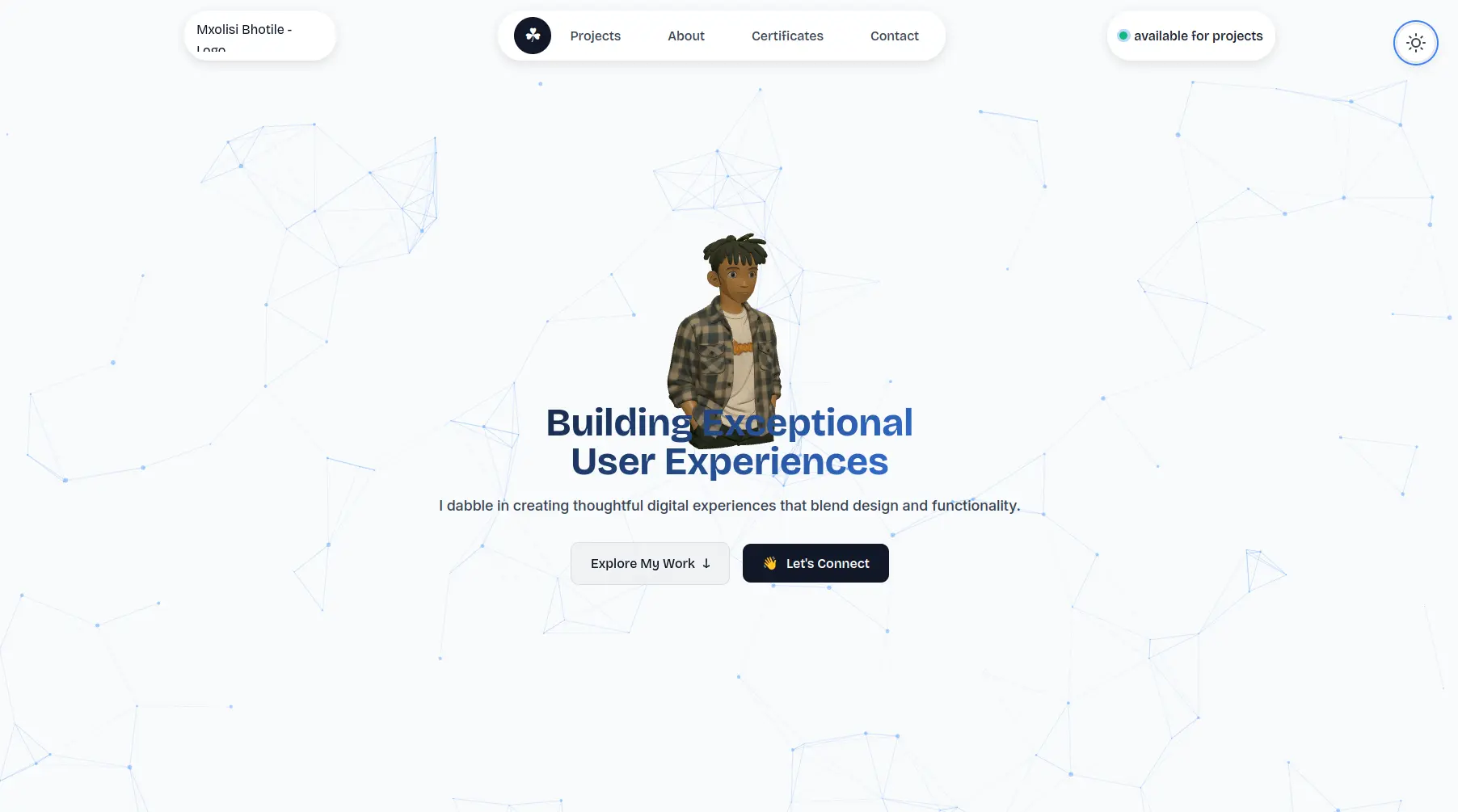
My Old Portfolio
A personal portfolio website built with Vite, Three.js, and vanilla JavaScript, showcasing interactive 3D modeling, dynamic project rendering, and thoughtful UX design.
Timeline
Finished personal project
Role
Full-Stack Developer, Designer
Team
Solo
Status
CompletedTechnology Stack
Key Challenges
- Balancing visual richness with performance on a static site
- Creating a responsive 3D viewer that works across all devices
- Dynamically reningdering project cards while preserving lazy-loading and accessibility
- Designing an intuitive information architecture that scales with more projects and content
Key Learnings
- Building with Vite for faster dev cycles and optimized production builds
- Composing Three.js scenes for real-time 3D model viewing in a static context
- Vanilla JavaScript patterns for state-free, modular component rendering
- Accessibility-first interactive UI (keyboard navigation, ARIA labels, focus management)
- Scoping portfolio features: showing work over perfect completion
My 3rd Portfolio
Overview
A personal portfolio website that showcases projects, certifications, and work across multiple domains. The site combines a performant static build with interactive 3D experiences, dynamic content rendering, and a carefully crafted information architecture that adapts to different screen sizes and input methods.
Why I built it
A portfolio is a living document of work—it should reflect the same care and intentionality as the projects within it. Rather than using a templated solution, I wanted to build something from the ground up that:
- Treats interactive features as enhancements, not distractions
- Respects the viewer's time and bandwidth (Vite for fast builds, lazy-loading for images and video)
- Works equally well on mobile, tablet, and desktop without forking the UI
- Scales gracefully as new projects are added or certifications change
Core features
Project showcase: A dynamically rendered list of projects with images, videos, descriptions, and multiple action points (live site, Figma design, GitHub repo). Video controls appear only on interaction, and media loads asynchronously to avoid blocking the render thread.
About me section: Modular cards covering profile, hobbies (drag-to-explore), toolkit (infinite scrolling rows of tech), location, and reading list. Each card is self-contained and loads its data independently.
Certificates & credentials: A grid of recognized expertise and continuous learning across technologies and domains.
3D hero section: A Three.js canvas with a preloaded .glb model (mxolisi.glb) rendered in the hero area, alongside a particle effect background. Responsive and accessible.
Theme toggle & dark mode: A moon/sun icon toggles between light and dark themes with smooth transitions. Preferences persist via localStorage and respect system settings.
Navigation & accessibility: Keyboard navigation (Tab for focus, Escape for mobile menu), smooth scrolling between sections, a scroll-to-top button, and proper ARIA labels on interactive elements.
Responsive design: Mobile-first approach with a hamburger menu on smaller screens, collapsible sections, and adapted layouts for touch vs. mouse input.
Tech stack
Built with Vite for rapid development and optimized production builds. Plain vanilla JavaScript (ES6+) with modular exports, no framework bloat. Three.js for 3D rendering, Particles.js for background effects. CSS-in-JS patterns via dynamically injected stylesheets and CSS variables for theming. Hosted on GitHub Pages with a fallback to Vercel.
Technical highlights
Modular, maintainable JavaScript
Each feature (projects, certificates, navbar, theme, particles) is a separate module exported and initialized in index.js. Adding a new section means creating a new file, exporting an init function, and calling it on DOMContentLoaded. No tight coupling, no global state pollution.
ProjectRenderer class for dynamic card generation
Instead of hardcoding HTML, a ProjectRenderer class consumes a simple data array and generates all the DOM nodes, handles lazy loading, video controls, and intersection observer logic. Adding or removing a project is a one-line change to the data array.
Lazy loading and performance budgets
Media loads asynchronously after page content has mounted. Videos don't show controls until hover or focus (preserving screen real estate). Images are marked with loading="lazy" to defer below-the-fold media. A 100ms timeout defers media DOM insertion to the next paint.
Accessibility baked in, not bolted on
Keyboard navigation (Tab focus, Escape to close menus, keyboard-driven video controls), ARIA labels on buttons and icons, focus traps on project cards, reduced-motion support via CSS, semantic HTML (nav, section, header, footer). Tested with screen readers and keyboard-only navigation.
Theme switching with localStorage and system preference detection
A themeManager module detects the user's OS-level theme preference, allows manual override, and persists the choice. Swapping between light and dark doesn't require a page reload—CSS custom properties update in real-time.
Responsive layout without media-query bloat
A single navbar adapts: desktop shows a horizontal link list, mobile shows a hamburger menu that slides in as an overlay. Instead of duplicating HTML, JavaScript toggles visibility and controls the mobile menu state.
Challenges
Getting the 3D hero to perform well on low-end mobile devices while keeping it visually striking took several optimization passes—reducing mesh complexity, baking shadows, and disabling auto-rotation on battery-saver mode. Handling video autoplay across browsers (iOS requires muted, others respect autoplay) required feature detection and fallback paths.
Building a project card system that works equally well for images, videos, and future media types (3D previews, interactive embeds) meant abstracting media creation into its own method and leaving room for extensibility.
Ensuring keyboard navigation and focus management didn't break the visual design required careful CSS (focus outlines, z-index resets on blur) and JavaScript discipline (focus traps, event delegation).
What I learned
A portfolio is as much about what you choose not to include as what you do. Animated page transitions, infinite scroll, real-time data from an API—all tempting, none necessary. The focus stayed on showcasing work, making it easy to navigate and contact, and keeping the site fast.
Vanilla JavaScript scales better than expected when modular patterns are respected. No framework overhead, no dependency tree to manage, just functions and classes that work together. For a static site, that's often the right choice.
Accessibility doesn't slow iteration; it clarifies design decisions. Asking "how does this work with a keyboard?" forced cleaner interaction patterns and fewer surprise bugs.
Looking ahead
I can't bring myself to delete this, Guess i'm sentimetal like that. Or maybe i just have attachement issues. Either way, i won't be working on it further.
Final thoughts
This portfolio is a working example of the principles it showcases: respect the user's time and connection, build for accessibility from day one, keep dependencies minimal, and let the work speak for itself. It's not about the flashiest animation or the latest framework—it's about clarity, performance, and care.