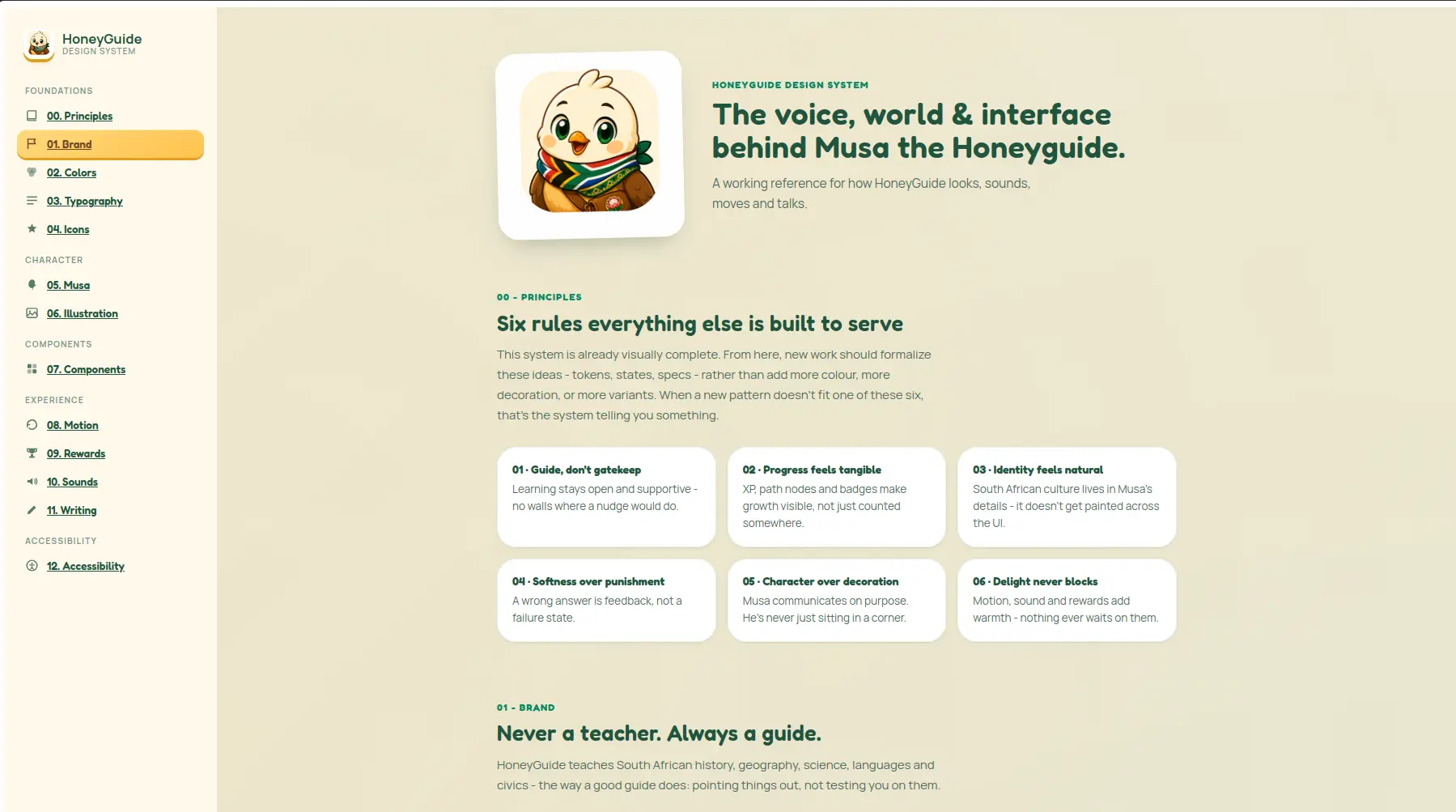
HG Design System
A living, single-page design-system reference documenting the voice, brand, tokens, mascot, components, motion and accessibility rules behind HoneyGuide, a South African learning app.
Timeline
Short solo sprint
Role
Frontend Developer
Team
Solo
Status
CompletedTechnology Stack
Key Challenges
- Keeping a horizontally-scrolling mobile nav in sync with an IntersectionObserver-driven "active section" state that has no natural scroll-position feedback
- Documenting a full color, spacing and shadow token system with no build step to enforce it, everything lives in hand-written CSS custom properties
- Making the same markup double as both a style guide and a working demo of the components it describes (real buttons, real badges, real path nodes)
- Retrofitting a mobile layout onto a two-pane, desktop-first shell without introducing a second parallel set of components
Key Learnings
- Structuring a complete design-token system in raw CSS custom properties without Sass or a build step
- Using IntersectionObserver to drive scroll-spy navigation across a long single page
- Using :has() to key responsive layout rules off content role instead of duplicating markup per breakpoint
- Writing accessibility documentation backed by measured contrast ratios instead of just asserting compliance
- Treating a style guide as a real, mobile-constrained product surface rather than an internal-only reference
HoneyGuide Design System
Overview
HoneyGuide Design System is a single-page reference site documenting the visual language, voice and interaction patterns behind HoneyGuide, a South African learning app fronted by its mascot, Musa the Honeyguide. It's not a mockup of a design system, it's the design system: brand principles, color and type tokens, iconography, the full character library for Musa, live component specimens, motion and reward patterns, writing guidelines, and a measured accessibility audit, all in one scrollable document with a persistent, section-aware navigation.
Why I built it
Design systems are easy to let drift, especially for a small, character-led product where "voice" and "personality" are as load-bearing as hex codes. I wanted a single source of truth that a designer, engineer or writer could open and immediately see not just what the tokens are, but why they exist, paired do/don't examples, real contrast ratios instead of assumed ones, and live component states rather than static screenshots.
Core features
Dual, section-aware navigation: a sticky sidebar on desktop and a horizontally-scrolling topbar on mobile, both generated from one data source and kept in sync with scroll position via IntersectionObserver, no router, no framework.
A living component library: buttons, badges, path nodes, progress bars and leaderboard rows are rendered as real, interactive elements, not screenshots, so states like hover, pressed, loading and disabled are things you can actually trigger.
Token documentation with receipts: every color swatch ships its hex value and usage note, and the accessibility section backs every claim with a measured contrast ratio table rather than an assumed "this passes."
The Musa character system: expressions, poses, unlockable accessories, a turnaround sheet, and a set of looping character animation clips (idle, reading, walking, waving), each mapped to a real product moment.
Voice and writing guidelines: paired say/don't-say examples for tone, naming, and UI copy, so "brand voice" stays checkable rather than aspirational.
Tech stack
No framework, deliberately: plain HTML5 and vanilla JavaScript (roughly 270 lines) driving a full CSS custom-property token system, no Sass, no Tailwind, no bundler. IntersectionObserver powers scroll-spy navigation. Every icon is hand-written inline SVG rather than an icon font or sprite sheet. Fredoka (display) and Manrope (body) loaded from Google Fonts.
Technical highlights
A token system enforced by convention, not tooling
Every color, radius, spacing step and shadow lives as a CSS custom property scoped to a single .hg-ds class. With no build step to enforce consistency, the token names themselves (--green-dk, --space-6, --r-pill) are the only thing keeping usage honest across ~1,100 lines of CSS.
Scroll-spy without a router
A single SECTIONS array in JavaScript generates both the desktop sidebar and the cloned mobile topbar links. One IntersectionObserver watching every <section> keeps both navs, and the active-state styling, in sync with whatever the user is actually reading, no page reloads, no routing library.
Responsive layout that keys off content, not breakpoints alone
Rather than duplicate markup to say "this grid should stack on small screens," CSS :has() selectors like .hg-grid.cols-2:has(.hg-value-card) target grids by what they contain, prose-heavy cards collapse to one column on narrow phones while compact swatch and icon grids stay multi-column, all from the same markup.
A component library that's also a demo
Every interactive specimen (clay buttons, path nodes, replayable motion stages) is the real component, not a picture of it. Motion demos include a manual "replay" trigger that restarts the CSS keyframe on click, which makes the animation section double as a QA tool for the timing values it documents.
Challenges
The mobile topbar was the hardest part by a wide margin: a horizontally-scrolling strip of thirteen section tabs has no built-in affordance that it scrolls, and no way to show where you are without extra work. Getting the active tab to auto-scroll into view as the page scrolls, and adding an edge fade so the strip visibly reads as scrollable, took more iteration than any single visual section. Close behind that was deciding, section by section, which two-column layouts genuinely needed to collapse to one column on small phones versus which ones (color chips, icon tiles) were compact enough to stay multi-column without becoming a duplicated set of mobile-only markup.
What I learned
Building a design system as a product, rather than a folder of Figma exports, surfaces problems a static document never would: does the nav actually track scroll position correctly, do the token names hold up under real component usage, does the accessibility section's math survive contact with the real hex values. It was also a good exercise in restraint, resisting the pull to reach for a framework or build step when a token system this size is genuinely well served by plain CSS custom properties and a few hundred lines of vanilla JS.
Looking ahead
The mobile topbar, while functional now, is the clearest candidate for a bigger rework: swapping the horizontal-scroll strip for a proper drawer or "current section" dropdown would scale better as more sections get added. Beyond that: a dark-mode pass (the token system is already structured to make this cheap), a print stylesheet so the doc doesn't export with sidebar/topbar chrome intact, and lightweight in-page search now that the document has grown past a dozen sections.
Final thoughts
This ended up being less about any single section and more about treating the reference document with the same care as the product it describes, real contrast numbers instead of assumptions, real components instead of screenshots, and a mobile experience that was designed, not just squeezed to fit.